UX Process Document
Airtribe Program Page Studio
Guardrailed internal tool for creating and reviewing program pages without design or engineering dependency.
Airtribe runs cohort-based professional programs in Product, AI, and Data. Each program has a program page covering hero messaging, program overview, curriculum, mentors, testimonials, pricing, and FAQs. These pages need to be updated frequently — but every change, no matter how small, currently requires involvement from a designer or engineer.
Core Design Principle
Structure over freedom. Users fill in content, not design. Every section is a guardrailed template, not a blank canvas. Consistency is a system property — not a human discipline that can be accidentally broken.
The bottleneck it removes
A 2-minute content fix currently takes 2 days via ticket. This tool collapses that to under 10 minutes — no designer or engineer involved. Pages stay fresh. Campaigns ship on time.
The guardrail it maintains
Non-designers can change content but not layout, typography, spacing, or visual structure. The design system is locked at the template level. Consistency is structurally enforced — not dependent on individual discipline.
Airtribe's program pages are owned by marketing and program teams — but they can't touch them. Every update, regardless of size, requires raising a ticket to a designer or engineer. A changed cohort date, a new mentor card, or a revised pricing block all create the same bottleneck. Pages stay stale longer than they should. Campaigns get delayed waiting for small fixes.
The Core Tension
Non-designers need enough freedom to do their jobs — but not so much that they accidentally break visual standards. The challenge isn't building a CMS. It's building the right constraints so that freedom and consistency can coexist.
Who is affected
| User | Type | Primary Need | Current Pain |
|---|
| Marketing Manager |
Primary |
Update campaign content fast, around program launches and enrollment cycles |
Every change needs a ticket. A critical date change takes 2 days instead of 2 minutes |
| Program Manager |
Primary |
Keep curriculum, mentor cards, and cohort details accurate with every batch |
Stale content erodes credibility. Can't fix it without engineering involvement |
| Program Owner / Stakeholder |
Reviewer |
Review and approve pages before they go live |
No visibility into what changed or when. Reviews content after it's already live |
✓
Remove the dependency bottleneckStandard content changes should require zero designer or engineer involvement.
✓
Maintain visual consistency at scaleEvery page produced by the tool should feel on-brand without a designer reviewing it.
✓
Feel like a form, not a canvasEditors fill in structured fields. They never touch typography, spacing, or layout.
✓
Enforce a review and approval flowContent should not go live without stakeholder sign-off — enforced structurally, not manually.
✓
Scale across all program typesOne tool should work for every Airtribe program — not a custom build per course.
✓
10 minutes from login to submissionThe full editing workflow — open, edit, preview, submit — should take under 10 minutes.
A1
Design system is pre-approved and locked
Typography, color palette, spacing, and section layout structure are owned by the design team and cannot be modified by content operators. Consistency is enforced by the template — not by individual judgment calls at the time of editing.
A2
Fixed section library with predefined layout variants
Users can populate, reorder, show, or hide sections from a fixed library — but cannot create new section types. Within each section, 2–3 predefined layout variants may exist (e.g. Hero with or without video, Mentors as grid or list). These are defined by the design team upfront.
A3
Live preview is always visible
Every edit reflects immediately in a read-only live preview panel. Editors see exactly how their changes will appear on the published page — in real time, without needing to save or toggle a preview mode.
A4
Internal-only — authentication is out of scope
This tool is accessed only by internal Airtribe team members. Role management, SSO, and authentication flows are assumed to exist at the infrastructure level and are not designed here.
A5
No direct publish — all content goes through review
Editors cannot push content live directly. Every page must go through Submit for Review, giving reviewers visibility and approval authority before anything goes live. This is a structural guardrail, not a workflow preference.
Primary · Editor
Marketing Manager
Owns campaign timelines and enrollment-driven content. Updates program pages around program launches, cohort start dates, and promotional cycles. Needs to move fast and can't wait for tickets.
Core PainEvery update requires raising a ticket. A campaign-critical date change takes 2 days when it should take 2 minutes.
Primary · Editor
Program Manager
Maintains curriculum, mentor profiles, and learning outcomes — content that changes with every new cohort. Closest to the actual program content and most aware of what's out of date.
Core PainStale curriculum and outdated mentor cards erode credibility. They can't fix it without engineering involvement.
Secondary · Reviewer
Program Owner
Reviews pages before they go live. Approves or requests changes. Consumer of the tool's output — not a daily operator. Needs clarity on what changed and confidence before approving.
Core PainNo visibility into what is being changed or when. Currently reviews changes after they are already live.
Flow 1 — Editor: Edit an Existing Page
Login → Dashboard
Editor lands on the dashboard. Sees all pages with their status — Draft, In Review, Live. Filters or searches for the page they need to update.
Select Page → Editor Opens
Clicking a page card opens the editor. Section list on the left, live preview on the right. Current content is already populated in all sections.
Click Section → Edit Fields
Clicking a section in the left panel expands it inline to reveal content fields. Heading, description, images, buttons — all structured with character limits. Editor fills in fields.
Live preview on the right updates in real time as fields are edited.
Save Section → Repeat
Each section has a Save Section button. Editor saves, moves to the next section, and repeats for any sections that need updating.
Submit for Review
When editing is complete, the editor clicks Submit for Review. The page status changes to In Review. The page is locked from further editing until a reviewer responds.
Flow 2 — Editor: Create a New Page
Dashboard → + New Page
Editor clicks the dashed New Page card or the + New Page button. Prompted to select a program template.
Select Template → Editor Opens with Placeholders
All sections are pre-populated with placeholder content. Editor replaces placeholder text — they don't build from scratch. This eliminates blank-canvas anxiety and keeps the structure consistent.
Edit Each Section → Preview
Same editing flow as Flow 1. Editor fills in each section, sees live preview update in real time. Can use the Preview button to see responsive views (desktop, tablet, mobile).
Submit for Review
Page goes to reviewer for sign-off before going live.
Flow 3 — Reviewer: Approve or Request Changes
Dashboard → In Review Tab
Reviewer sees all pages awaiting approval in the In Review tab. Status indicators clearly separate them from Draft and Live pages.
Select Page → Read-only Preview
Reviewer opens the page in a read-only mode. They can scroll through the full page as it would appear live. They cannot edit any content.
Approve → Live · or · Request Changes → Draft
Approve sends the page live immediately. Request Changes returns the page to Draft status with a note for the editor explaining what needs to change. Editor is notified and can re-edit.
Section list (left panel)
List entries (add/remove)
Architecture Principle
Every level of the IA has one job. The dashboard tracks page state. The editor manages section structure. The section editor handles content fields. No level bleeds into another's responsibility.
The Approach
Most internal tools are designed top-down — someone defines features, then screens get built. I worked in reverse. Before designing a single Studio screen, I extracted and rebuilt Airtribe's existing live program page from scratch. Not as a reference — as a deconstruction exercise. To understand exactly what content lives where, what varies per program, and what stays consistent across all of them.
STEP 01
Extract
Pulled apart Airtribe's live program page. Mapped every section, every content block, every repeating pattern. Identified what was fixed structure versus variable content.
STEP 02
Deconstruct
Recreated the program page in Lovable to understand its component logic — what makes each section independent, what fields it needs, and what constraints keep it on-brand.
STEP 03
Invert
Designed the Studio by flipping the output into an interface. Every section in the editor maps directly to a section in the live page. Every field was discovered — not invented.
Studied Airtribe's Resume Builder to understand their existing design system, component conventions, and editing patterns across the product suite.
The Studio was aligned to how Airtribe already builds — then enhanced, not reinvented.
This approach meant the modular architecture wasn't a design decision — it was already encoded in the program page itself. The Studio didn't need to be flexible enough to produce any page. It needed to be precise enough to produce this page, reliably, without a designer in the loop.
Live Landing Page → Sections identified
Hero — Headline, subtext, CTA buttons, tags
Program Overview — Stats, duration, learning items
Curriculum — Phases, topics, tags, expandable
Mentors, Testimonials, Pricing, FAQ, CTA
Studio Modules → Directly mapped
Hero Section — 4 fields, 2 button pairs, tag editor
Program Overview — Metrics + repeatable list entries
Curriculum — 2-level hierarchy, drag, topic editor
Remaining sections → same pattern, same system
Why this matters
Starting from the output meant every design decision had a concrete reference point. The question was never "what should this field do?" — it was always "what does this field need to produce?" That constraint made the Studio sharper, simpler, and more accurate to what Airtribe's teams actually need to edit.
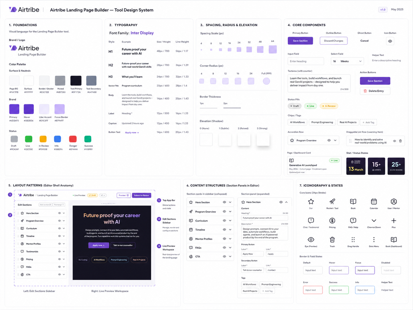
This design system defined the rules behind Airtribe Program Page Studio, from semantic color tokens and Inter Display typography to form controls, accordion rows, stat cards, section templates, and editing states. Every editable section was built with guardrails, allowing teams to move fast while keeping every page consistent, scalable, and on-brand.
SCREEN 01 — Dashboard

The dashboard gives editors and reviewers a unified view of all program pages with clear status indicators. Filter tabs — All, Draft, In Review, Live — reduce noise and let users find what they need immediately. The dashed New Page card is a persistent, discoverable entry point that sits inline with existing pages rather than being buried in a menu.
SCREEN 02 — Editor (Collapsed view)

When a section is clicked, it expands inline to reveal its content fields. Character counters, structured inputs, and a clear Save / Discard pattern keep editing predictable and safe. The live preview on the right updates in real time — editors never need to mentally simulate what the output will look like.
SCREEN 03 — Editor (Active section editing)

The editor in its default state — all sections collapsed in the left panel, live preview scrollable on the right. The breadcrumb, status chip (Draft), version selector, Preview button, and Submit for Review button are all visible simultaneously in the toolbar. Editors have full context about where they are and what state the page is in without needing to scroll or open any menus.
SCREEN 04 — Hero Section

The Hero section edit panel exposes heading, description, primary and secondary button labels with link fields, and keyword tags. Every field is typed and constrained — character limits prevent text overflow, button links are validated paths. The editor never touches font size, color, or layout. The design system is invisible to them but enforced at all times.
SCREEN 05 — Program Overview Section

Program Overview contains structured metric fields — duration, start date, expert count, live sessions — alongside a repeatable Learning Section list. Each list item is expandable into its own Edit Entry sub-panel for granular editing. Editors add, remove, and reorder learning outcomes without ever opening a design tool.
SCREEN 06 — Curriculum Section

The curriculum section uses a two-level hierarchy — phases at the top level, topics nested inside each phase. Each phase is draggable. Topics within a phase can be added, removed, and edited in their own sub-panel. Tags are editable at the phase level. The live preview renders the accordion-style curriculum exactly as it will appear to prospective students.
D1
Structured form, not freeform canvas
Each section expands into typed fields with character limits and input constraints. Editors change content — never layout, typography, or spacing. Consistency is enforced structurally, not by asking people to be careful.
Why this
Visual consistency cannot be optional. Multiple editors, multiple programs — the system has to hold.
Tradeoff
Flexibility is intentionally limited. Edge-case content needs (e.g. custom layouts) still require a designer.
D2
Split layout with persistent live preview
Section list on the left, live preview on the right — always visible simultaneously. Editors see exactly how changes will appear on the published page in real time. No save-to-preview step, no mental simulation required.
Why this
Reduces cognitive load. Editors don't need to context-switch between editing and reviewing output.
Tradeoff
Left panel space is constrained on smaller screens. Responsive editing view needs a toggle on tablet.
D3
Status as a shared language across all levels
Draft, In Review, and Live appear at every level — dashboard card badges, editor header chip, and topbar. All team members have a shared, unambiguous understanding of page state at all times without asking anyone.
Why this
Reduces coordination overhead. "Is this live yet?" becomes a question the UI answers, not a Slack message.
Tradeoff
Status visibility alone doesn't communicate what changed. Version diff is a missing piece in this scope.
D4
Submit for Review instead of direct Publish
Editors cannot push content live directly. Every page must pass through a reviewer. This is a structural guardrail — not a workflow preference — that protects page quality and creates clear accountability.
Why this
Adds a quality control layer the current ticket system ironically doesn't enforce. Stakeholders have real authority.
Tradeoff
Slightly longer path to publication. Reviewer availability becomes a new bottleneck if not managed well.
2d→8m
content update turnaround
Routine cohort dates, mentor cards, pricing blocks, curriculum edits, and FAQ changes become self-serve instead of waiting in a ticket queue.
2w→6h
idea-to-publish cycle
New campaign pages can move from approved content to review-ready output in hours because repeatable sections are already mapped into structured templates.
For Marketing Managers
- Campaign-critical edits no longer need designer or developer bandwidth.
- Launch pages stay accurate during enrollment and cohort cycles.
- Live preview makes changes reviewable before submission.
For Program Teams
- Curriculum, mentor, and cohort details can be corrected while context is fresh.
- Every editable field maps directly to a live program page section.
- Outdated content stops blocking trust during program discovery.
For Review Workflow
- Locked templates preserve layout, spacing, typography, and brand consistency.
- Draft, review, and live states make ownership visible across teams.
- Approvals focus on content quality instead of layout cleanup.